
Project number one is for my number one person. My husband is starting a new job too – a professor at a local university. I’m using his class to play with designs.
The first task was to identify the color palate for the university. A little google search got me to the brand book, so I could grab the colors. Their colors are scarlet and navy. Next was to look at what the Husband (as he’s called on my other blog) created. I wanted to use his design style. He likes cartoons and anime looks, so I kept a lot of his illustrations that he made.
I built a very minimal template. Just a block of the scarlet, and a block of the navy with a page number in white. We are simple folk, so I used TNR and Arial as my fonts. For each course, I will have a different style for the first page. For genetics, it’s a white background with a spinning DNA strand.
One thing that I use a lot are the notes pages. I spend a fair amount of time looking at the notes pages. So many people use the power point slide deck as presentation, student handout, and instructor’s manual. When it does all of these, it does none of them well. But giving the students access to the notes pages and handouts, you can make it usable as all three.
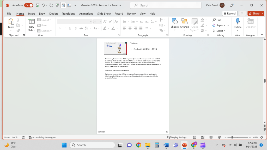
For this one, I made the slide small so there’s a lot of real estate for the notes themselves. I like having the information and a lot of space for notes. I also added a date portion so they know what date the notes are from, and a text box to include citations so the students can look things up if they want.
The handouts are just the slides with lines to the right, I’m not a huge fan of them, but I think that the regular notes pages will be sufficient for this one. I’ll work to see if I can build better ones.
So now to the content itself. I have very little idea beyond basic understanding of the concepts that a lay person would know. But I have my SME to make sure I don’t change the meaning. I looked for pictures that fit what I was looking for – and if I didn’t find what I wanted, I made it.
For example, the glossary image I just took a glossary of genetics terms, ran it through a word cloud program with my color scheme, and clipped it. The cartoon illustrations he made and brought over.
It took a little longer because it’s the first one – I made some changes to the templates. I made the font bigger for the title – it was the same font size as the first line of text. With the fonts I used, it looked like the first level font was bigger. I also moved the citation box over a little to separate it from the box on the right of the slide.
I recorded the presentation and exported it to .mp4, but the video parts didn’t export. I’ll have to troubleshoot this for my next one.
I’ll post new ones as I make progress. You don’t need all of his slides, but as I get proficient in this, I’m moving up to Canva, since that will integrate, and then Articulate for quizzes and such.
